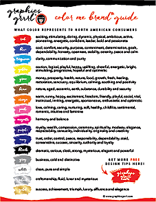
Let’s talk about what color represents to North American consumers:
Red: exciting, stimulating, daring, dynamic, physical, ambitious, active, pioneering, energetic, confident, leader, bold and passionate.
Blue: cool, comfort, security, purpose, contentment, determination, self-sufficiency, dependability, honesty, openness, perspective, goals, stability, serenity, peace and calm.
Turquoise: clarity, communication and purity.
Yellow: caution, logical, uplifting, progressive, cheerful, energetic, stimulating, happy, bright, playful, hopeful, inquisitive and optimistic.
Green: money, prosperity, generosity, health, nature, food, growth, fresh, healing, balance, restoration, sanctuary, equilibrium, calming, soothing and positivity.
Brown: nature, aged, eccentric, earth, substance, durability and security.
Orange: warm, sunny, happy, excitement, freedom, friendly, playful, social, vital, instinctual, inviting, energetic, spontaneous, impulsive, enthusiastic and optimistic.
Pink: love, calming, caring, nurturing, soft, healthy, childlike, sentimental, romantic, intuitive and feminine.
Magenta: harmony and balance.
Purple: deep, royalty, wealth, compassion, ceremony, religious, modesty, elegance, respectability, sensuality, spirituality, individuality, originality and creativity.
Navy: trust, order, control, peace, responsibility, dependability, staid, conservative, success, sincerity, authority and loyalty.
Black: dramatic, serious, sleek, strong, mysterious, elegant and powerful.
Gray: business, cold and distinctive.
White: clean, pure and simple.
Silver: fluid, lunar and mysterious.
Gold: success, achievement, triumph, luxury, affluence and elegance.
Now you see why I chose red and black as my core colors. I wanted something dramatic, bold and stimulating to stand out online!
In addition to these general interpretations, there are other factors to consider when choosing color.
Geography. Color can be interpreted differently in other parts of the world. For example, white symbolizes death in Eastern and Asian cultures. It is used in funerals and represents sterility, mourning, unhappiness and misfortune.
Physiology. Different colors give out different wavelengths and frequencies and when these enter the viewer’s eyes, the neurological pathways trigger different responses in the brain. For example, the eye has the inability to focus on red and blue at the same time. Try to read red type on a blue background or vice versa—you’ll see it causes eye fatigue because of the type appearing to “dance” or jump. Red physically increases the heart rate, while green is the easiest color for the eyes to process and can be used to relax.
Monitor differences. Color can appear different from screen to screen. The variation of screen color is the reason the 256 websafe colors were created, as each of their hexadecimal values are considered fairly reliable and consistent across different monitors. (However, these also could vary depending on the individual settings of the user.)
Printing variation. Four-color process printing can vary from printer to printer and even from the beginning to the end of the run on the same press. Quality assurance checks are conducted to keep the tones consistent throughout the printing process, and even though approved values get locked into the print job’s color profile, slight variations are to be expected. To improve upon these variations, PMS (Pantone Matching System) colors, otherwise known as spot colors, are used.
They’re known as “spot” colors because PMS colors use one plate of information on offset presses. Pantone colors serve as the go-to reference for everyone—designer, client and printer— to all agree that THIS is the exact color to use.
You can download a Pantone color chart pdf here, but please note colors may look different on your screen or printed via your office/home printer. For true accuracy, you need to reference the actual Pantone book—and a new one printed on bright white paper if possible. I’ve purchased the complete Pantone kit that costs over a thousand US dollars, but you can begin with the Pantone Starter Guide for $50.
But how can you apply these meanings to the logos and overall branding you create? Here are some examples of how color can be applied to every industry.

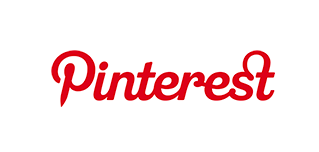
Red is best when used as an accent color as it is can overwhelm, but there are tons of examples of completely red logos (Target, Coca-Cola, and Virgin as shown here). The reason it’s used on the clearance rack or on the “buy now!” button is because it creates a sense of urgency and encourages buyers to take action. Even a touch of red represents excitement, passion and an energetically-driven business.


Orange is used as a call to action color to buy, sell or subscribe. Tech, health and travel industries can benefit from orange to suggest excitement, vitality and energy.


Yellow grabs attention! Often used as an attention-grabbing color in children’s products and food, especially fast food, because of its association with youth, optimism and freshness. Too much yellow can lead to agitation, so it’s best when used as a highlight. And be careful when pairing yellow with black as it evokes bumblebees, hazard and warning signs! I am surprised at how many logos do use a yellow/black color combination as one would subconsciously think “unsafe” or “stay away”—but they do grab attention.


Green is a good choice for businesses wanting to portray themselves as environmentally friendly or as financially viable especially in the US. It also bodes well when used for organic products or cosmetics as it’s perceived as being healthy.


Clarity of thought and communication, as well as the connotation of purity such as in clean water, form the very essence of turquoise. Use it to promote water filtration, pool cleaning, medical or hydration products and communication services.


No other color is used in branding as much as blue. It’s seen as reliable, stable and trustworthy and is associated with truth. Conservative corporations often use this color to promote customer loyalty.


Law firms, banks and the education sector communicate authority and responsibility with the color navy.


Many beauty and anti-aging products as well as many other businesses use purple to symbolize richness, achievement and intellect. Purple also appeals to children and can be used in toys and candy packaging.


Dental and medical industries often use virginal and pure white to depict cleanliness. White is simple and calming, but should be used in combination with other colors, since alone it could be portrayed as cold and sterile.


Want a logo color that depicts authority, power, luxury and control? Then black is the way to go, but use it carefully, since it can be intimidating. Combine it with jewel tones for a rich effect.


Art dealers, writers, costume designers and other artists do very well with magenta in their logo. Magenta is also beneficial in industries where you want consumers to let go of their old ideas and accept new ones. For this reason, coaches and mentors benefit from the use of magenta.


Pink is seen as feminine and hence more suitable for the beauty and fashion industries, toys for girls, and candy or gum. Businesses that wish to depict sentimentality or trendy products for teens and pre-teens can utilize light pink to great effect.


Looking for a serious, neutral color for your logo? Then opt for gray which is perfect for legal and financial companies and can be suitably combined with dark blue, gold, yellow or really any color for other industries.


It’s the gold standard for items of high value! But, be careful, gold can tend to look like a dirty yellow if gradients and reflections aren’t used. Gold combines well with navy, crimson, and dark green.


Silver is ideal for businesses selling tools and gadgetry as it communicates craftsmanship. Again, it can read just as a dull gray without gradients or reflections to provide highlights and depth.


Many whole food and organic companies combine brown with green in their branding to indicate safe and natural products. And brown gives an earnest, authentic vibe to products, especially when used with aged textures.


So now that you know the meaning of different colors and their possible market application, what colors do you think would be good fit for your personal brand or business? Comment below what corporate logos do you think are sending the wrong message about their brand with the colors they’ve chosen?
please follow, like & share:


Reading your website is a big pleasure for me; it deserves to go viral!
Thank you! I’m so glad you enjoy my blog and find the graphic design resources helpful!