A concept or “meaning” is usually behind a good logo, and it should be able to communicate this intended message: 1) without color, 2) at small sizes, and 3) in any medium—which is why logos should be: 1) designed first in black and white, 2) evaluated at reduced scale, and 3) created in an infinitely scalable vector-based program like Illustrator (and NOT Photoshop).
To demonstrate if a logo I’ve designed “has legs” and will work for the myriad of applications the clients has, I’ll show the logo large and in color, but also small and in black and white. I think I got into the habit of presenting logos in this way (and, if applicable, also adding in a reduced grayscale version of it) from when I worked at agencies. But to be honest, I’ve been doing it for so long, I can’t remember where I learned this trick. Here’s an example of how I would present a logo to a client: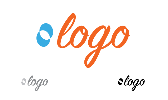 And I do this for each solution I present, so each logo can be assessed on its own merit, yet still placed next to other treatments when deciding and ultimately discarded without affecting the others.
But only solutions that follow the five basic principles of good logo design are ever considered. If I ever design a logo that doesn’t take these five principles into account, I quickly eliminate it before I ever show the client!
In essence, you can think of a logo as being the heart of a company’s identity, so it should be strong. Therefore a good, strong, effective logo is: 1) simple, 2) memorable, 3) timeless, 4) versatile and 5) appropriate.
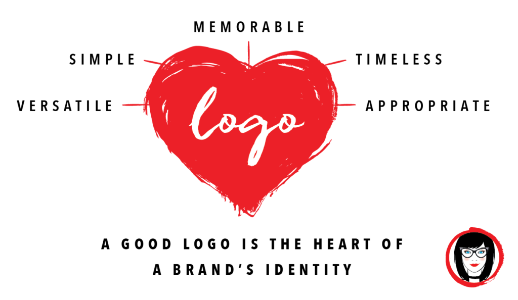
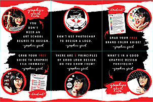
You can download a free printable pdf of this graphic with the 5 principles of logo design here for your reference.
1. simple
A good logo must be simple. A simple logo doesn’t mean it’s simplistic. Often the most elegant solutions visualize complex ideas very simply. Boiling something down to its core essence allows for it to be easily understood and recognized. A busy or cluttered logo with a lot of elements to distract the eye actually detracts from the impact of its message. Additional elements like “LLC” or “Inc.” and other details are not necessary to have in the logo. The logo itself can have detail, but it should be simple enough to make a statement quickly. A refined identity will catch the attention of a driver going 70 miles per hour past a billboard, of a buyer walking past packaging on a crowded store shelf, or of a reader scanning a banner ad online.
Great examples of simple logos are the Target bullseye, the Shell gas station gold scallop, and the Nike swoosh. (Given the swoosh is one of the most recognized icons in the world, isn’t it hard to believe that the designer was only paid $35 for it?)
But in order for a logo to express its message simply, the target audience must be considered. I always ask a client about the core demographic they are trying to capture and then I ask them the $100 million dollar question: what is the ONE thing you want to leave customers feeling about your brand? I literally ask them to give me one adjective that best describes what they want to convey to customers. (Now upon occasion, part of the problem can be that the client doesn’t really know what their brand personality is, so sometimes market analysis is needed to help clarify this for them before we can narrow it down to what their one, main impression or feeling should be.) But an elegant and simple logo evokes this mood and reflects this core attribute–just like Nike swoosh emphasizes speed and forward motion to its athletic customers.

2. memorable
A good logo must be memorable. Distinctive features are necessary to create a logo that is memorable. Memorable can mean using vivid colors, illustrative elements or an optical illusion, but it definitely needs to somehow create a visual statement that engages the eye. When viewing a logo, the audience should instantly recognize it, interpret the message and distinguish the company from others in its industry in order to remember it.
To be remembered, a logo must be unique and should stand out from a slew of others in the same market in order to communicate its message. The average consumer is flooded with commercial messages all the time: on tv, in magazines, in apps and games, on signs, in the mail or online. And all but the most memorable messages will become just noise that the brain filters out.
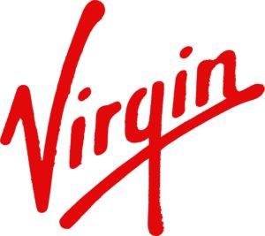
A memorable logo doesn’t use trite icons that have been exhausted in its market or necessarily show what a company does. The Harley Davidson logo isn’t a motorcycle, the Greyhound logo isn’t a bus, the Mercedes logo isn’t a car, the Virgin Atlantic logo isn’t an airplane, and the Apple logo isn’t a computer. So similarly, if you are designing a logo for a coffee shop, it doesn’t need to show coffee beans!
3. timeless
A good logo must be timeless. An effective logo endures the ages to be effective in 10, 20, 50+ years’ time, and not look dated or stuck in the past. To avoid this, a logo shouldn’t be trendy. Styles come and go, and while that’s fine for fashion, it’s not ideal for a brand’s longevity. Avoid locking a logo into a certain time period by using the uber trendy fonts and techniques du jour. (To this day, I can tell right away that a logo was made in the late ’90s if it has an ellipse orbiting around it!)
One aspect that helps lend itself to a timeless quality of a logo is its adherence to good design principles and overall aesthetic: its use of form, symmetry, and balance, for example. These recognizable elements should remain–even if the logo evolves over time.
Probably the best example of a timeless logo is the Coca-Cola logo. Unlike the Pepsi logo, it has barely changed since 1885. Now that’s a timeless design!

4. versatile
A good logo must be versatile. A strong, effective logo translates across a variety of mediums and adapts to its application. For this reason, a logo should be designed in a vector format to ensure that it can be scaled to any size. This means the logo is most likely created in Illustrator. Please remember this when you see a logo on Fiverr saying that is will be created in Photoshop and realize you may need to recreate it as an infinitely scalable version in Illustrator if you ever want it to be enlarged to scroll across a billboard one day, like the timeless Coca-Cola logo has.
Some considerations that lend themselves to versatility include:
Color. A logo must be successful in both black and white as well as full color. A logo may also need to be reduced to one spot color to reduce costs in printing promotional items such as a branded hat or window decal, so the use of color should be strategic. Different colors have different meanings worldwide, so this is where knowledge of color theory comes in handy.
Scalable. A logo should work at any size: be it on a pen or a billboard. If possible, test the design to see if it works at a minimum of around one inch without loss of detail. When a logo does not reproduce well on a small scale, it causes problems for a brand’s clarity and value.
Cross-Media. A logo should work on a variety of media such as websites and in print. It should be functional on a variety of printing substrates such as a film wrapper if it’s a brand that will appear in all types of packaging, for example.
One way around creating a versatile logo is to begin the design process in black and white only. This allows the focus to be on the concept and shape first and helps ensure that the logo will look good in its simplest form. Color is very subjective and emotional and that can distract from the overall design–say if you saw your logo in all red, that color may be the first thing that you respond to and not the composition of the design elements.
5. appropriate
A good logo must be appropriate. The positioning of a brand’s logo should be appropriate for its intended audience. For example, if you’re designing a logo for a children’s toy store, it would be appropriate to use a juvenile font and color scheme. The use of these; however, would not be so appropriate for a conservative law firm, for example.

With regard to being appropriate for its intended audience, I’d like to once again reiterate an earlier point that a good logo does not need to show what the company does. For example, a brand of car does not need to have a car in its actual logo.
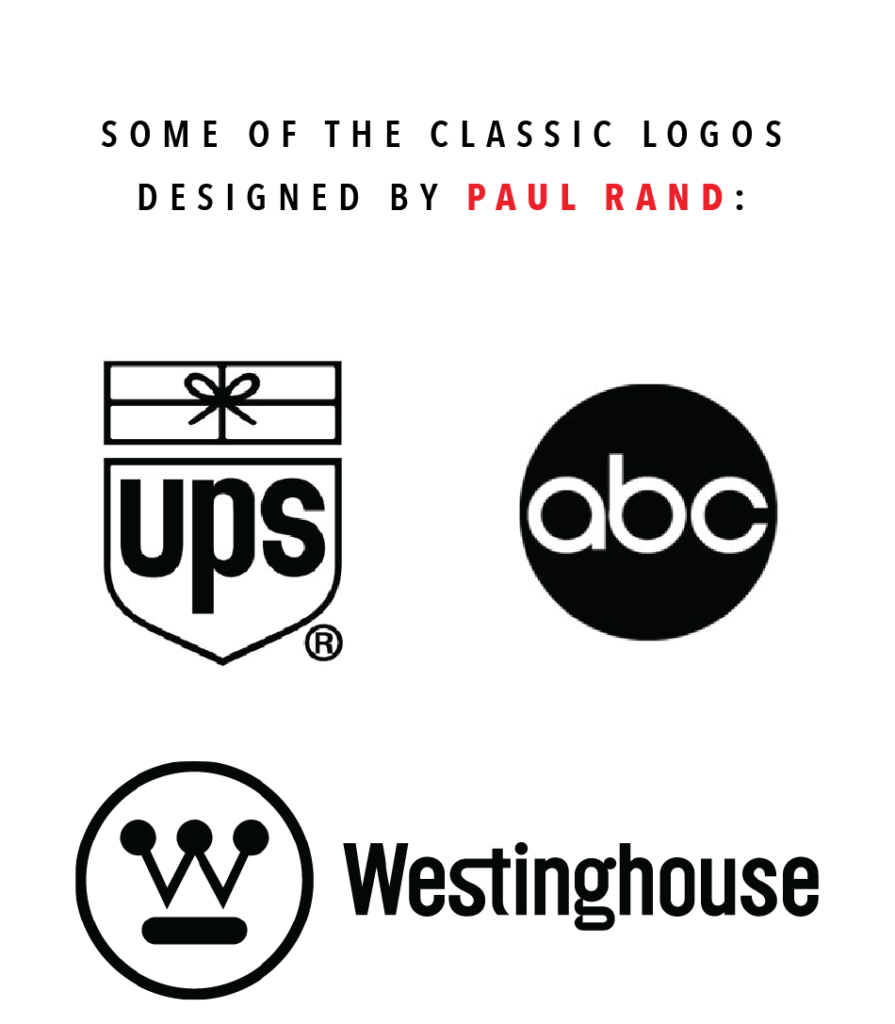
And to end with the great Paul Rand again: “A logo is less important than the product it signifies; what it represents is more important than what it looks like.”
Now it’s your turn. What do you think makes a logo good?
please follow, like & share: